Colour Psychology Marketing – The Why And How (2023)
In content marketing, it is essential to stand out and be noticed. To be successful in a competitive industry, you need to make the right moves and have the right look. That’s where colour psychology marketing comes in. Use the right colour and your audience will be intrigued and interested.
We’ve all heard that colour can evoke emotions and create feelings on a subconscious level. Well, it’s true. With the right colour psychology marketing strategy, you can be distinctive.
When you use the right colours, your audience sees what you want them to and feels what you want them to. As a result, they will do what you want them to do – support your company. The colour tints and hues that you use affects your marketing strategy more than most people even realise.
Colour psychology marketing plans are aware of all this and use it to the advantage of the brand. Having this knowledge is important because making poor colour choices will also have effects – negative ones.
In this article, we will introduce you to the basics of colour psychology marketing and show you how to use it. Once you’re done here you will be able to design your content with a new appreciation of colours.
Ready? Let’s get right into it!
Colour Psychology Marketing In 2023
We will start off by looking at the basics of colour theory. Once you understand this, colour psychology marketing will make a lot more sense to you.
Understanding colour isn’t just meant for artists and graphic designers, it is something that any content marketer should know. No matter what you do, you will be using colour in your content.
Primary Colours
There are three colours that make all the other colours you can think of – red, blue and yellow. They are used to make secondary colours. There are, of course, exceptions when discussing primary colours.
When you take into consideration light, your primary colours would be magenta, cyan and yellow. However, we’ll keep things simple and stick to just red, blue and yellow. For a basic understanding of colour psychology marketing, you can get away with knowing only the basics.
Secondary Colours
The next set of colours are purple, green and orange – you make them by mixing your primary colours. Red mixed with blue make purple; blue mixed with yellow creates green and red mixed with yellow gives you orange.
Tertiary Colours
Now, you take your colours one step further and create colours that have two-word names such as red-orange and yellow-green. These are created by adding more of a primary colour to another primary colour, creating a dominance of that colour.
Pure Colour
These are the before-mentioned colours without adding a third colour or white or black. They are pure and also called saturated. You’ll notice that they are bright, cheerful and a bit intense. Toy manufacturers, daycares and summer clothing designers often use these colours.
Tints
You get tints when you add white to a pure colour and they are also known as pastel colours. They are pale and light when compared to a pure colour and there is none of the bright intensity.
Shades
These are almost the opposite of tints and are created when black is added to a pure colour. They are much darker and duller than the other colours.
Tones
You create colour tones when you add grey to a pure colour. Grey is made by mixing black and white together. A tone is usually called for when a colour is seen as too intense.
There you have it – a completed colour wheel with the primary, secondary and tertiary colours as well as shades, tints and tones.
Cool And Warm Colours
You will sometimes hear a colour be described as ‘warm’ or ‘cool’. Cool colours are found on the left side of the colour wheel among the greens and blues. You’ll find the warm colours on the other side among the reds and yellows.
Now you have a basic understanding of the colour theory and the colour wheel. Now we can move on to learning even more about colour psychology marketing.
Colour Psychology Marketing – Contrast
When creating colourful and unique content, making use of contrast is very important. You have to use it correctly though, or you’ll create beautiful content that isn’t very easy on the eyes.
What Is Contrast?
This term describes how one colour stands apart from another colour. It is what helps to make images, objects and text be distinguished from the background. When we talk about high contrast, colours stand apart from each other and look good. When the opposite happens, it is called low contrast.
It is not the difference in colour that creates contrast. To really see the contrast between two colours, make them grayscale and you’ll see it more clearly. When colours are the same level of grey, they have the same tone. That means they will not have much contrast. For an in-depth discussion of colour contrast, check out this guide. There are also tools that you can use to determine the contrast between two colours.
High And Low Contrast
When creating your content, there is a place for contrast and important content should get the most attention. As such, you’ll want to use high contrast for that content. Just be careful when using high contrast because it can be tiring on eyes after a while.
For example, bright yellow or red text on a black background will make you squint. In general, you should go for dark on light and light on dark.
Low contrast colours are often used by people who have more knowledge about colour psychology marketing. This gives content a much more beautiful appearance. However, beautiful doesn’t necessarily mean easy to read.
You will have to find a balance between the tones, contrast and beauty of the content you create. Always keep in mind that people are going to have to be able to easily view and read your content. People who wear glasses or have trouble seeing colours might not appreciate the colours you choose.
When you start creating your content, we suggest that you create a colour scheme that is attractive and easy to view. This may call for a bit of experimentation. Which brings us to our next point…
Colour Psychology Marketing – Selecting Colour Combinations
You can use the colour wheel to help select great colour combinations for your content. It will be quite helpful when creating your infographics, call to action buttons and any pop-ups you want to add.
In general, people prefer simple combinations with only two or three colours. Use too many colours and your audience will be left feeling jarred and confused.
Choosing those two or three colours can be a little difficult though. Let’s look at how you can make the right choice.
Complementary Colours
In this case, we mean opposite colours rather than colours that are cute and complimented your hair. They are opposite each other on the colour wheel. This kind of colour psychology marketing helps make things stand out and is used by everyone, even sports teams. (Take a look at your favourite teams the next time you get a chance)
Examples
- Red – opposite of green
- Yellow – opposite of purple
- Blue – opposite of orange
Never has the phrase ‘opposites attract’ been more true. Just remember that you don’t want to go 50-50 with these colours. If you do, they’ll confuse your audience. Rather go for an approach that will make one colour pop out – it’s more appealing.
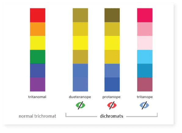
Colour Blindness
You have to remember that there are many people out there who are colour blind and you have to make your content accessible to them as well. For example, red and green are common problem combinations to people who can’t distinguish between certain colours.
There are three types of colour blindness – tritanope, protanope and deuteranope. Each type sees colours differently and you have to keep that in mind when choosing your colour scheme.
Colour psychology marketing is a lot more complicated than most people think, as you’ve realised by now.
Blue is a popular colour because it seems to cause the least issues. When choosing complementary colours and keeping colour blindness in mind, remember to have high contrast. Also, don’t use colour as the way to give your audience important information. Use text and graphs too.
Analogous And Monochromatic Colours
Another thing that you need to keep in mind with colour psychology marketing is analogous and monochromatic colours.
The first are colours that sit next to each other on the colour wheel and they are seen as being related. Together, they create a relaxed and pleasing visual experience. They don’t really stand out from each other and can help to create really beautiful content. However, you will have to use complementary colours to make certain things stand out.
Monochromatic colours are just one colour with all its tones, tints and shades. They are softer and much more subtle than analogous colours. When you pair a monochromatic colour with one complementary colour you will get an impressive colour scheme.
Triangle, Rectangle And Square Colours
These terms refer to specific colour combinations. A triangle is a colour combination that is made of three different colours that are evenly spaced on your colour wheel. A rectangle is a combination made up of four different colours that have two complementary pairs. A square is much like a triangle but with two complementary colour sets. They are also evenly spaced on the colour wheel.
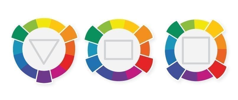
A word to the wise: these colour combinations can be visually busy and noisy so be careful with them. We suggest you use one colour as your dominant and use others to highlight your content.
Now, let’s get into why you really started reading this article.
Colour Psychology Marketing
There is a lot of psychology that goes on behind colours and most of us don’t even realise it. Colour has an effect on how we think and behave. It has the ability to direct our eyes on where to look and how to interpret what we see. That is why colour psychology marketing is so important to content marketers.
Of course, colour is somewhat subjective and not everyone has the same reaction to colours. Our experiences with colours are different and how we look at it reflects that. Fortunately, we can guide you in the right direction so you can make the most of colour in your content creation.
We’ll discuss all the most common colours and their psychology so you can decide how you want to use them in your content creation strategy.
Red

This is a bold, powerful and dynamic colour. It reflects people’s need to show love and affection as well as survival, fear and terror. It is a rather energising colour that can also represent strength and friendliness. But red is also complex in that it can show aggression, depending on how you want to use it.
For the most part, if you want to get your audience’s attention or have a powerful presence, you’ll like red. Of course, it has to be used in moderation so you won’t be aggressive and evoke negative reactions.
Blue

Trust and dependability, that is what blue makes people think about. It represents reliability, mental relaxation and responsibility. It is one of the most-liked colours in the world.
Blue allows people to destress and be calm. They will be more positive and think about ideal situations. However – and here is that complexity of colours again – blue can also be seen as unfriendly and cold when used in big amounts.
For the most part though, blue is a great colour that creates a sense of calm and trust.
Yellow

Joy, cheerfulness, optimism and happiness are the feelings that yellow represents to viewers. But as with all colours, there is a deeper complexity here that is important for colour psychology marketing. Yellow is great for lifting people’s spirits, boosting their confidence and inspiring them. But it is also able to cause critical thinking which can result in anxiety and self-esteem issues. If you can find the right balance in using yellow, you can evoke great happiness and inspiration though.
Orange

This is an interesting colour that mixes the energy and power of red with the fun and friendliness of yellow. It is a great way to conjure up feelings of comfort, food, shelter and warmth.
Orange is also a great representation of a positive attitude, enthusiasm and motivation. If you need to bring comfort in difficult times, orange should be your first choice.
Green

This natural colour is all about harmony and balance. It gives people a clear sense of right and wrong and creates a balance between emotions and logic. Purple is a very natural colour and reflects peace, life and rest. It is also a colour of growth – monetary and natural.
To create a sense of stress relief, health and rest, you should use green. It can have negative connotations such as materialism though, so be careful.
Purple

This colour is known for spirituality and imagination – it has red’s power and blue’s reliability. It has the perfect balance between the spiritual and physical. Often, it is also used to show mystery, loyalty, luxury, magic and courage.
Purple is able to soothe as well as represent new ideas, making it popular with creativity. You should not use purple too much though because it can cause introspection. People’s thoughts can also start to wonder when seeing too much purple.
Pink

This is a soft and much less intense version of the aggressive and energetic red. It creates a sense of unconditional love and compassion. That makes it the perfect colour for representing care, nurture and understanding.
Often, pink is seen as a sign of hope and it can also be very romantic. The colour shows sensitivity and empathy. However, in too many amounts, pink can be draining and represent a lack of power. Sometimes, it is even seen as immature. It is a great counter-colour for red when used the right way.
Brown

This is often seen as a boring colour but can represent protection, structure and security. It is a serious colour that is down-to-earth and solid. Reservation is a feeling that brown can make people feel very easily.
But, if used right, brown can also come across as luxurious, rich and tasteful. We don’t suggest that you use it too much though because most people are not interested in this colour.
Gold

It goes without saying that gold creates the feeling of luxury, wealth and charm. It depends on the viewer’s culture, but gold is often associated with confidence and treasure.
Also, this rich colour can evoke a sense of friendliness, prosperity and abundance. For the most part, it is seen as attractive and appealing. But, use it too much and it creates a sense of pride and self-righteousness. We recommend that you use gold sparingly and only for highlights.
Black

When people see black they think independence and sophistication. It creates a sense of seriousness and control. Black is also the go-to colour for representing evil. But it can show mystery, depression and death (mourning) as well.
This is a reserved colour and is ideal for creating contrast and improving your content’s legibility. Since so much negativity can be associated with black, it is best to use it in your text more than your visuals.
White

The purest and most complete colour of them all – snow. It represents innocence, purity, peace and cleanliness. White can be all about new beginnings and clean slates.
White has an equal balance of all colours so it has many meanings. Most of all, it is about equality for this very reason. It is a great colour for idea creation and simplicity. Avoid too much white though because it can evoke feelings of loneliness, isolation and emptiness.
Silver

This colour is often associated with high-tech and modern themes. It is also industrial and sleek while being sophisticated, elegant and glamorous. Everything depends on how you use it.
It can symbolise wealth and riches as well as meditation, tenderness and unconditional love. It can also be associated with coldness and distant isolation, so use only to highlight.
Honourable Mention: Bright Colours
We won’t be going into detail with what every bright colour means in terms of colour psychology marketing, but we will mention their importance.
There is something that all bright colours have in common – they promote activity and being ‘busy’. In contrast, softer colours promote mental reflection and visual tasks. Bright red can stimulate the nervous system and blue can relax it.
Bright, warm colours can make people overestimate the passage of time. On the other hand, cooler colours can have the opposite effect. Colours truly play an important role in how we perceive our world and how your audience perceives your content. Don’t underestimate the power of using the right colours in your marketing strategy.
Colours And Gender
It is true that men and women experience colour differently and react in their own ways. Simply put, men and women have varying colour preferences. This is something you should consider when looking at your audience and marketing plans.
Blue is the most favoured colour by men with more than half of them choosing it. Only about a third of women prefer blue. Women tend to prefer tints rather than shaded colours like men do.
In general, both genders prefer cool colours over warmer ones. As people get older, they seem to equally dislike yellow and orange. This could be because of its vibrancy.
Final Thoughts On Colour Psychology Marketing
There are many ways in which you can use the psychology of colour to your benefit. Now that you’ve learnt what the colours mean and how you can use them, we suggest you plan your marketing strategy accordingly. If you need more help in ‘beefing up’ your strategy, feel free to check out our blog. We discuss a variety of content marketing-related topics. From incorporating influencers in your strategy to the latest trends, we discuss it all.