
Call To Action – The Why And How Of This Marketing Strategy
No marketing campaign is complete without a proper and engaging call to action. It is what calls on people to take action, as the name suggests. A good call to action (CTA) will help your target audience know that they should click to visit your website or have another important action take place. It’s the ‘Buy Now’ button that we all know. They are on advertisements and landing pages everywhere.
Having a call to action that provides ample information is advantageous to everyone involved – possible customers as well as the marketer. With a good call to action, you will get the right people to click on your button. In addition, you will also dissuade the wrong people from reacting. Your audience will know what to expect when they click on your ad or button.
Of course, your call to action has to be sensible and related to your industry and it has to be done well. In this guide, we will discuss more reasons why CTAs are important and how to make the most of them.
Basic Ways To Enhance Your Call To Action
Make Use Of A Command Verb
You want to be concise and clear with your call to action. In general, you don’t get a lot of space in your advertisement, so you’ll have to use what you get economically. You have a set limit of 35 characters per description line. As a result, you need to effectively use your limited resource. Your CTA is how you will be able to get the desired reaction, but only if you use it right.
That is why having strong commanding verbs will be your best bet. For example, if you have an e-commerce company, you will use words such as ‘order’, ‘buy’ or ‘shop’. If you are advertising software or a newsletter, use words such as ‘subscribe’ or ‘download’. If you need people to request more information, use the words ‘Find out how’ or ‘Fill out this form for…’. Start your CTA with the action you want people to take. Make it easy for them to know what you expect them to do.
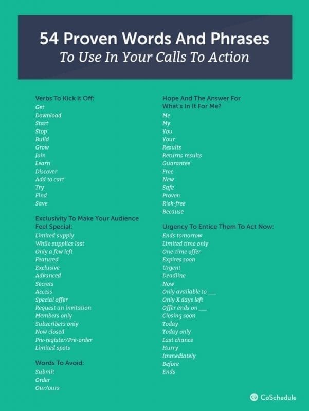
Here is an example of strong verbs that are great for use in a CTA, courtesy of CoSchedule:
Be clear about what it is that your CTA will give anyone who clicks on your ad. Don’t be vague or boring. Instead, draw attention and intrigue viewers of your call to action. For example, rather than saying ‘Our new book has been published’ say ‘Check out our new book about murder mysteries today!’. Make people want to click on your ad and get access to your content or website.
Use Words That Provoke Emotion
Getting a response from people is much easier if you use the right words. You want either an emotional response or cause enthusiasm. If you use a CTA that is enthusiastic, your audience will feel that same emotion. A very simple phrase such as ‘Buy Now And Get 50% Off!’ could get great clickthrough rates. You are getting people excited about getting half off, and who doesn’t want to save that much? Of course, don’t deceive people. This is certain to blow up in your face.
Use words that will entice your audience. If you’re an airline, a call to action using the words ‘Plan Your Dream Holiday Today!’ will get more reaction than something less exciting such as ‘Plan Your Next Vacation With Us’. Your CTA needs to pop and have something that makes it stand out and ‘talk’ to people.
Give People A Reason To React
People are all about ‘what is in this for me?’ so if you can answer that question you will get more of a reaction from them. If they know there is a good reason, they will take the action you want them to. The value of your proposition is very important and will help you get new leads. With the words ‘Call Today For A Free Consultation’ is a good example. You tell people when to act and what they’ll get if they do.
Get Creative With Your Call To Action
Marketing is more about being creative than very clever. If you can entertain your audience, you can pull in more sales. Your CTAs have to be fresh and creative. Brainstorm puns and wordplays and figure out how that can be used in your call to action marketing strategy. However, be careful to not try too hard and sound strange or even fake.
You may have to play around with different creative CTAs to see which work better and have the best results. You may find that something that looks on paper during a brainstorming session doesn’t work as well once put into action. Trial and error is a good way to learn which CTA strategies are the most successful.
Make People Fear Being Left Out
The fear of missing out (FOMO) is a strong driving force behind many decisions that people make. If you can tap into that fear (in a respectable way, of course), you can get a new and fresh way to get more clicks. Make it clear that your offer or special will not last forever. Create a sense of urgency by pointing out the time-sensitivity. Holidays and special occasions are a great time to use this method.
Know The Devices You’ll Use
Having good knowledge of the devices where you will be using your call to action strategy is important. You need to customise and optimise your marketing to best suit the different devices that your audience uses. While it is possible for some desktops and tablets to be similar in screen sizes, the same can’t be said for mobile devices.
You need to tailor your CTA to be effective and attractive on all the platforms where it will be seen. Most people will likely see your CTA on their mobile and you need to be able to draw them in there. Using the words ‘Call Now’ are great for mobile platforms. This will prompt them to call and engage with your brand or company.
Google allows you to set a mobile preference for your advertisements. This allows you to designate certain ads to only show up in searches that were completed on mobile devices. Thanks to this, you can easier focus on making your CTA suitable for mobile viewers.
There are also call extensions that you can enable. These will let you display your company’s phone number with your advertisements. You can choose this option for all devices and it is highly suggested that you make use of it. However, Google has a specific way that these extensions are shown on mobile devices. Rather than showing your number, a ‘Call’ button will be available. This allows for easy dialling and is known as a ‘Click-to-Call’ function.
Use Numbers If You Can
Numbers are a great visual tool for consumers – they like to see digits. Make use of this and show your audience your promotions, discounts and pricing with bold and big numbers. Never write them out. It is a good idea to have numbers as part of your call to action marketing strategy. It gives people an idea of what they can expect to pay for your service or product. If you don’t share prices from the start, some people could be left cold when they finally see what you charge. You don’t want that. If people are clicking on your ads, they are interested and you want them to know what kind of spending to expect right from the start.
Experiment with the way you use numbers in your CTAs. Use percentages and creative language to keep things interesting. For example, ‘Book Now And Save 20%’ is much more compelling than ‘Use Our Service To Save Money’.
Good Practices When Using Call To Action Marketing Strategies
There are certain things that you do when you’re working out which strategy to use with your call to action buttons, and some that you don’t. We will look at the best practices and some things you should not be doing.
Creative Button Shapes
When trying to create the perfect call to action button, you shouldn’t neglect the button itself. It is almost as important as the language and words you use. Keep in mind that the button’s appearance should form part of the overall feel and theme of your entire marketing campaign. The last thing you want is to confuse your audience. Would rounded buttons work better than square ones? Do you want to use buttons that look like clouds or shaped like a star? Be creative but make sure you’re using a uniform approach. You may have to test different buttons and see which works the best.
Text Should Be Short And Sweet
You don’t want your button text to drag on for ages. It may feel necessary to get your point across, but it is suggested that you keep things short. This may take some practice, but you’ll get there sooner rather than later.
Colours Matter
The colour of your button is very important, as it is in all marketing strategies. You may think it’s nothing more than an aesthetic aspect, but the colours you use can greatly affect the success of your call to action buttons. Again, remember to keep things uniform – don’t use pastel colours for your buttons if your brand palette is bright and vivid. Interestingly, orange and green buttons have been reported to perform really well. This is likely because they stand out so much, but remember that the appearance of the background plays a role as well.
Use First-Person Speech
When addressing your audience, you want them to feel like they’re been personally spoken to. This is how you get them to take action. Although it is tempting to use second-person speech (‘Here’s Your Free Sample’), it has been found that switching to first-person (‘Try My Free Sample’) can increase your click rate.
Your Text Must Be Legible
Using fancy fonts may seem like a good idea, but if your audience has to squint or re-read your call to action, they’ll lose interest. Use text that is large and easy to read. However, don’t go too big or you will annoy people. Some people find large lettering threatening or obnoxious.
Consider Adding Bonus Text
This won’t be true in all situations, but sometimes you’ll want to add some extra information. While we suggest that you keep things short, concise and clear, there are exceptions to the rule sometimes.
For example, if you’re offering a free trial, you may want a button that says ‘30-Day Trial, No Credit Card’. Then, in the next line, you’ll actually call people to action with ‘Start The Free Trial’.
Take A Chance With Language And Tone
This is something you’ll want to try if your brand is one that has a more friendly and humorous feel. You can use negative words, but only if you do it well. It is recommended that you plan this one really careful lest it blows up in your face. Basically, you’ll want to use a negative word and then turn it into a positive thing.
For example, if you’re offering remodelling services, you could say something like, ‘Your Kitchen Looks Crappy, Let Us Give It New Life’. It can be a bit brash for some so use this only when you’re sure you can actually pull it off. If done right, you’ll get people to smirk or chuckle and click on your call to action – mission accomplished.
Have The Focus On The Right Place
Sometimes, it will happen that you have other buttons on your website or web page that are not your call to action buttons. These should definitely not grab as much attention as your CTAs do. You want the focus to be on the CTAs, at least in this case. Make sure they are the biggest and brightest of the bunch. Consider using monochromic colours when choosing colours.
Use Enticing Words
Of course, this should go without saying. It is only natural that you will be using words that entice people to click and take action. But just in case you forgot: use words that make people want to react, such as ‘free’. ‘Free’ is actually a very good word, especially if you’re offering something that is, well, free.
Use Graphics Creatively
You can sometimes work in graphics that will enhance the appearance of your CTA. Small arrows are a good example. However, try not to overdo it and risk annoying people. Use icons that make sense and are related to your brand. Don’t confuse them by using random graphics with no obvious link to your page, service or products.
What To Avoid With Your Call To Action
As we mentioned above, there are certain things you would want to avoid when you’re creating your CTAs. By heeding our advice here, you’ll avoid wasting your time on methods or ideas that are not at all effective. Let’s take a look at some of them, shall we?
Do Not Hide Your CTAs
You really don’t want to place your CTAs in areas where people will not immediately see them. In fact, you want them within the ‘eye path’ of your audience. Place them where people will see them without searching a page.
This is because your CTAs have absolutely no value if they’re not being seen. Many marketers make the mistake of neglecting their CTAs. Don’t be one of them.
Do Not Use Improper Language
In this case, improper language is anything thing that is vague, passive and cliché, or passive language. Of course, the normally-expected clean language that is expected should still be remembered. The most effective CTA is one that uses action verbs (as we mentioned earlier) and clear instructions (also mentioned earlier). Use compelling language that will entice and entertain and you’ll see better success than with bland and uninteresting call to action language.
Do Not Link Your Call To Action To Your Homepage
This may seem like strange advice but your homepage is the landing page for lots of traffic from many different sources. You want your call to actions to lead to a different space to make more of an impact. Instead, have your CTA lead to a page that has everything to do with what you promised. If you are offering a free trial, take people to the page where you tell them what they’ll get. This way, your audience ends up where they expected when clicking on the CTA. It can be confusing to land on a homepage when you’ve clicked on a CTA button.
Do Not Use The Word ‘Submit’
Although it seems like a logical choice when you want to get people to click on your call to action button, the word ‘submit’ can be quite annoying. People don’t like the idea of ‘submitting’ things. Rather go with words such as ‘Get Your Free Trial’ or ‘Buy Now’. These are much more effective.
Do Not Use Small CTAs
Just like you don’t want to use CTAs that are placed in areas where they can be missed, you don’t want them to be so small they’re not noticed. Make them nice and big and bold. You want your CTA to stand out and it has to be big to achieve that.
Do Not Oversell
There are few things as frustrating as being promised something just to find out it’s not real. The same sentiment applies to marketing. Don’t make false promises that you can’t keep just to get people to click on your call to action buttons. It is a cheap trick and your brand will lose the respect of its audience.
Do Not Forget That Design And Copy Can Build Trust
You can use testimonials and data to show your audience that you’re more than just talk. The best way to show people that you’re trustworthy is by having professional design, case studies and testimonials that prove that you can do what you promise your audience.
Do Not Miss Chances To Promote Your Call To Actions
You can put a call to action everywhere you go and it’s not a bad idea at all. All of the platforms that you’re using in your marketing campaign can be a place to put your CTAs. As long as you don’t go into the ‘overkill’ territory, you’ll be okay. There is a fine line though, so do be careful.
Do Not Use Colour Wrong
We have mentioned earlier that the colour of your CTA is important and it’s so important that we will briefly discuss it again. You need to make sure that whatever colour you use for your CTA doesn’t clash with your page colour and theme. Having a bright green call to action on top of a green background won’t be visually pleasing. Instead, having a light purple call to action over a green background could work much better. Be sure to use colours that compliment each other.
Do Not Use Flat Designs
You want your CTAs to stand out. An effective way to do this is to make them come to life with hover effects and shadows. Avoid having a simplistic and flat design for your call to action.
Do Not Use Call To Actions Incorrectly
You should let your call to actions relate to the content that is on the page or aligns with your audience’s needs and interests. Shoving your CTA down people’s throats at odd times and in places that don’t make sense will only hurt the number of clicks you get. Pushing your CTA too soon or with the wrong people will result in unhappiness for you as well as your campaign.
Do Not Overwhelm A Page With CTAs
You should use one primary and one secondary call to action on a page to avoid giving a ‘spammy’ feeling. If you’re flooding people with CTAs you’ll annoy them and none of your call to actions will stand out as anything special.
Do Not Use Complicated Animations
It may be tempting to use all kinds of creative and cute animations, but we suggest that you don’t. You should use content that is optimised for mobile use and easy desktop use as well. If you’re using a call to action that cannot be viewed for some reason then you’re missing out on reaching more people.
Do Not Obsess With Being Perfect
This may be difficult but try not to obsess about getting a perfect design. Yes, you want a professional design, but being obsessive won’t get you anywhere. You should focus more on the content and getting the right reactions that having a perfect design. There is a fine line of balance and being too focused on one can lead to neglect of other aspects.
Do Not Use The Same CTAs All The Time
You should do A/B testing (testing two designs or methods to find the best one) to find the CTAs that is most effective for your marketing strategy. Using the same CTAs for too long won’t work forever. You may lose the chance to rope in more leads if you don’t change things up a bit occasionally
Do Not Limit The Value Of Your Call To Action
Branding should not be the sole focus of your CTA, you should give your audience something that they want and need. The focus is on them, not you or your brand. The point of a CTA is to get people to use your service or buy your products. If you put the primary focus on your brand rather than what’s in this for your audience, you’ll lose clicks and sales.
Do Not Forget SEO
Search Engine Optimisation remains an important aspect of marketing no matter which methods you’re using. Always remember to have keywords in your CTAs and everywhere else that you can put them. But keep things balanced, no one likes to see content that is stuffed with keywords.
Do Not Use The Same Call To Action For Everyone
Your brand will have a diverse persona that it is aimed at marketing to. This means you shouldn’t have the same CTA for everyone because no one is the same. Personalise your CTA to suit the audience that you’re reaching on the different platforms that you’re using for them.
Creative Call To Action Examples To Learn From
Now that you have an idea of why you should have call to action buttons and how to create them. Now, let’s see what it looks like when a CTA is done right. The examples here serve as learning material – you should study them closely and see how you can implement the same ideas in your marketing campaign.
KISSmetrics
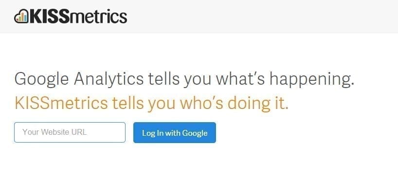
This is a fairly simple example but it shows just how well a simplistic approach can actually work. This call to action makes use of Google’s credibility to enhance its own – a cool and effective strategy.
This CTA works well because KISSmetrics doesn’t require its audience to do too much. It explains very clearly what users can expect and doesn’t cause any confusion. Getting started with them is very easy and the wording also creates some curiosity. Overall, a great blend of creativity and marketing is shown by KISSmetrics. You’ll find that by using such a simple but interesting method, you’ll get many people interested in your brand and/or company.
Contently
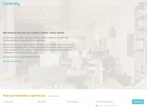
Here, the call to action is as inviting as the logo and it is a definite win for Contently. You’ll notice that Contently did not go with the usual ‘Submit’ but rather changed it to suit their brand. With their approachable language, the brand creates a sense of community. In addition, the call to action hints at what you can expect from the brand. There is no feeling of being ‘sold to’.
Crazy Egg

Crazy Egg offers an online application that provides tools to track a website’s operation. They are also very good at marketing, as you can tell from their successful call to action. It is compelling and visually very pleasing. They used elements that are bold and compelling, making you want to click. You learn that Crazy Egg is risk-free and reassures that they are a safe option. The verbs used here are what really drives the interest.
Manpacks
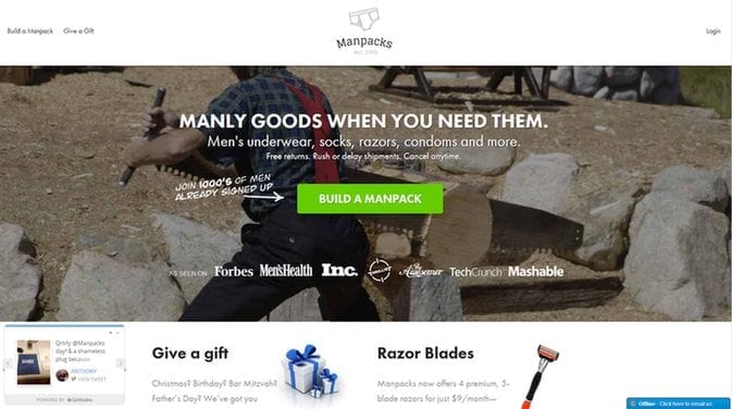
You can see from this CTA that by speaking the prospective customer’s language, you’ll be able to rope them in quite effectively. This call to action example shows that very clearly. Although the products on their own are not at all very interesting, Manpacks taps into men’s desire to build stuff.
Less Accounting
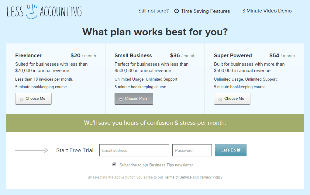
Getting people to take action isn’t at all easy. But Less Accounting makes it very appealing to do just that with their creative call to action. This one really outshines its competition. With a positive vibe, this company is able to create an ‘in it together’ feeling. The colours used are also very calming – definitely a good decision by the team behind the end result. With the words used, you are given the feeling that you’re entering into a partnership. This is a very good strategy and really works, especially when combined with such a personal feel.
Dropbox
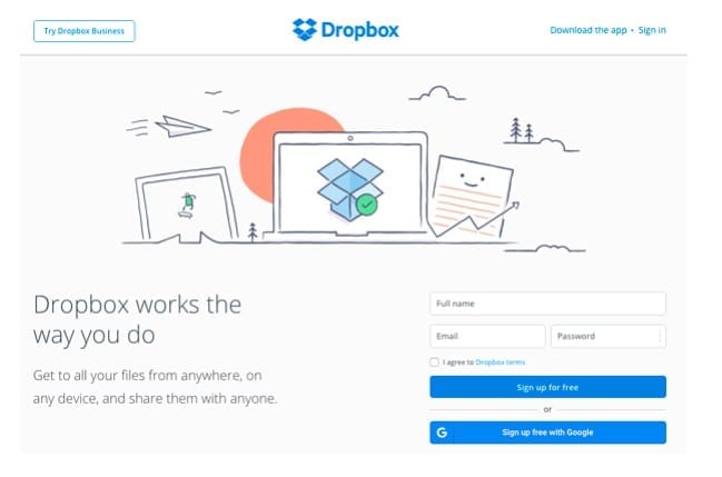
This cloud storage provider has always been about simple design and not wasting creativity on unnecessary elements. Here, you’ll see that again. The graphics on their website is simple and subtle and that’s something that users have come to expect and respect.
Dropbox used the same simple approach with their call to action and it works amazingly. That’s because it is easy to associate the CTA with Dropbox and everything flows together so well. The colours are used well and the straight-to-the-point language is effective.
Conclusion
After you have finished reading this guide call to action and how to use this marketing method, you’ll be able to use it in your campaign. These buttons are very useful and a great way to drive traffic. As long as you use it correctly, call to action buttons can greatly boost your brand awareness and sales. Good luck!